Detailed Design – Digital Dosette Box

After choosing between the alternatives, the detail design of interactions and presentation helps creating the wireframes and interactive prototype.
Prologue : Three TeaPots – Donald A Norman
Donald Norman’s prologue “Emotion and Design- Attractive things work better, “Norman (2002) posit the aesthetic usability experience is where a user will perceive an attractive product as easier to use than an ugly one. As a good-human centred product personality influences our perception as such that users will make subconscious concessions and overlook many difficulties.
It says that design matters, but its preferability varies depending on the occasion, the context and the mood, emphasizing different teapots exemplified on its usability, aesthetics and practicality. Quoting, all pleasurable things are not necessarily usable.
He also exemplifies the notion that beauty is indeed usable. Therefore, it’s a hidden danger to neglect aesthetics and should be kept at par with the functionality aspect.
As the design of the system influences the positive or negative affect, thereby the affective system impacts the cognition and behaviour of the user.
The neurochemicals releases a positive valence to the environment thereby enabling a correlation between latency in task abandonment in relation to better aesthetic. Also, it creates a broader imagining power of an individual, while enhancing the usability. On the contrary, negative affect creates a tunnel vision leading to more frustration but not distractible.
Positing the importance of all the works done so far in the usability field, Norman strides at keeping balance between beauty and usability since a pleasant aspect along with well-functioning and understandable, is always more beneficial.
Affective and cognitive analyses needs an increased recognition for aesthetic keeping usability on par in the typical design process.
Designing a Digital Dosette Box

A task at each stage of Interaction Design was for designing a digital dosette box.
Each week we had different levels of learnings for designing a successful digital dosette box at the end of the module. Each session provided us with multiple though process and understanding user satisfying dosette box to be created.
It all started with, understanding, what a digital dosette box has to offer to the users and how a user interacts with it. In a group of 4, we had a good brainstorming session to understand some of the basic requirements for the people using a dosette box. Initially, it all started with designing it from a complex level to add all the advance technologies to it and make it as smart as possible. But our further sessions on user data collection and using user data, got us to a simple dosette box considering different age groups of people using it.
A dosette box helps people to take their daily medicines in a remindful organized manner who have to take it daily for their health issues.
Considering all the requirements and features, I designed a digital dosette box. The main focus while designing the digital dosette box was good usability and positive user experience. Some of the features I tried focusing on were effectiveness, efficiency, utility, safety, learnability and memorability.
Interaction Design : Community gardeners
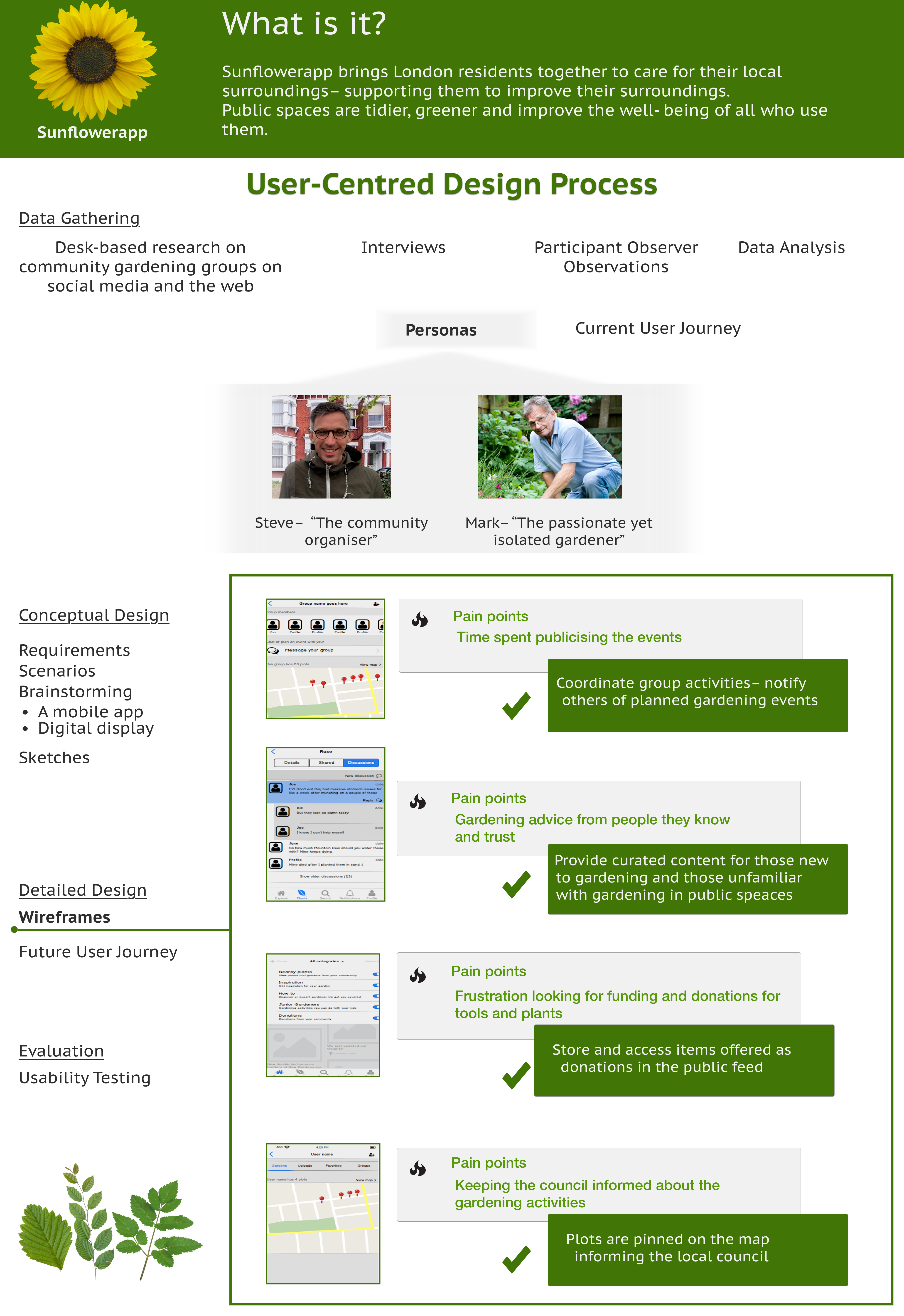
In order to design a digital content tool for community gardeners in a group of 4, our data gathering focused on understanding how community gardening groups operate, and finding out what content they create and share. We decided against questionnaires as urban gardening was an unknown community for us and observations would help us better understand the users’ context, tasks and goals. Interviews allowed us to probe participants for additional details, clarify questions where needed and potentially ask spontaneous questions regarding topics or elements previously not considered.
We decided to create open-ended questions to be used in an informal and semi-structured interviews, our research goals were exploratory . We created a set of questions as both a checklist for interviews and to help maintain consistency across each interview.
The interviewees reviewed and signed a consent form prior to the interview . We recorded each interview instead of taking notes as it allowed us to pay more attention to interviewee. We transcribed all the relevant sections of the interviews in order to be able to analyse the data. To triangulate our interview findings and further empathise with our community, we carried out an observation.
We reviewed the observation notes and interview recordings and analised the data using categorisation approaches.
Then we craeted personas based on data collected in our user research process. Goals for our personas centred around their objectives within the community and the gardening activities they carried out. We also included a biography and photograph to bring the personas to life.
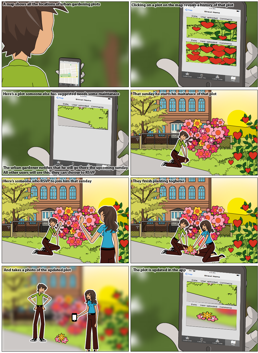
Considering our personas we began to tease out the system requirements bearing in mind our brief to create a tool to enable content curation within a community.
Representation of user journey was our initial stage of design, where it helped us to drive the user data we collected. It mainly exists in the ongoing dialog which takes place between designers and users.
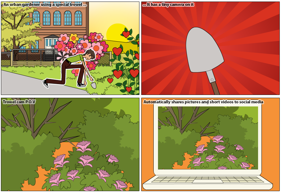
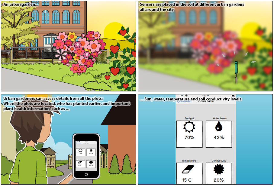
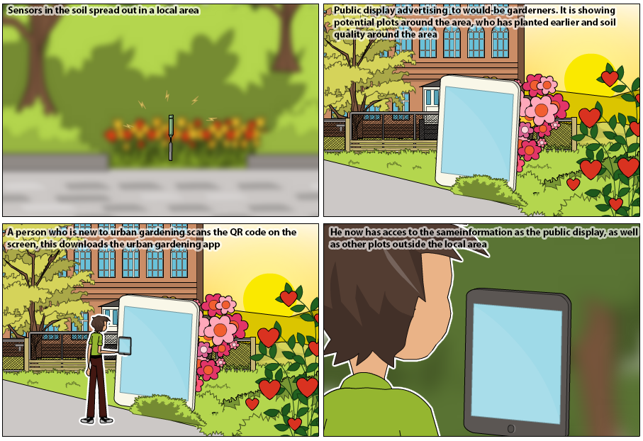
The current user journey helped us analyse, what role exactly does the current tools and applications takes place to aid users in the whole process of community gardening. Also helped us to understand, what are some of the features and functionalities these web tools provide, e.g. uploading and sharing pictures of gardening, group gathering meetings update, etc.
We created multiple alternative designs for our future prototype. It mainly included all the possible design ideas from the data gathered about the users and their tasks.
These low-fidelity sketches, which were quicker to create, were helpful to us in enabling early visualization of alternative design solutions, which helped us provoke some new innovations and improvements to our prototype. We carried out opportunistic evaluations to see if our paper prototype met the requirements we had identified. We approached two users at the community group we had observed earlier in the design process and carried out usability testing street-side using the methodology. They could usefully interact with our interactive prototype. But it lead us to some changes in our design. In order to improve the product usability and user experience after the evaluation we made the following changes to our prototype:
- Search interface and results were added to the home screen as it was one of the first things users mentioned during the think-aloud technique.
- The map feature was removed from the main menu.
- Add an event was removed and the feed can be used to share large public events.
- We reduced the number of steps involved in adding gardening activities.
Finally we created the detailed interactive wireframes following official human interface guidelines. Working on this project was a great opportunity to see the Interaction Design project going from start to end.
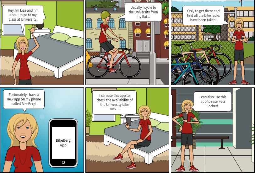
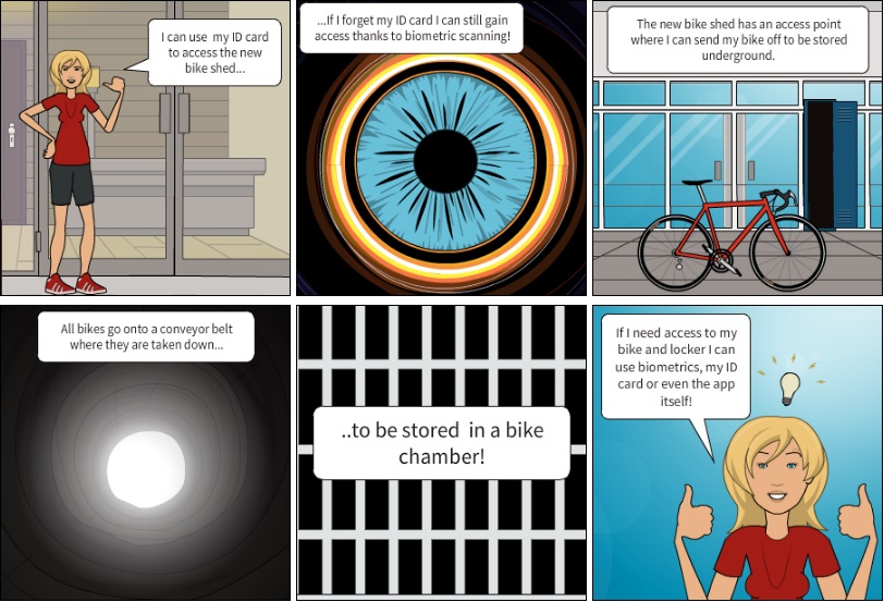
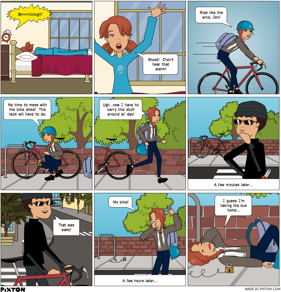
current user journey – bike
Current User Journey – Gardening

Alternate Designs – Gardening
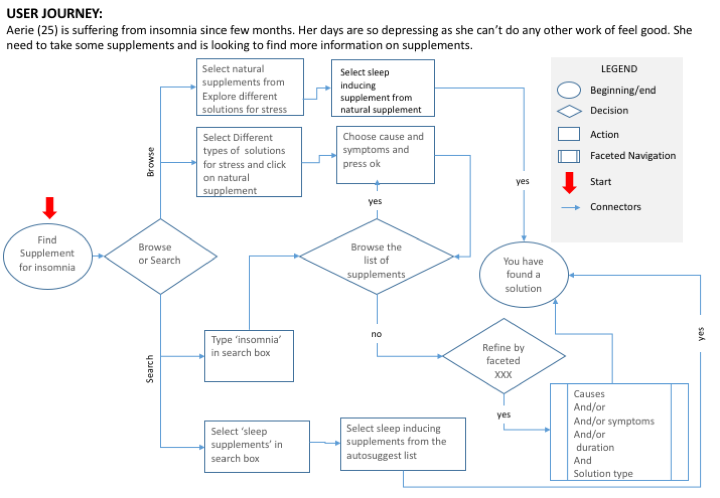
user journey – Naturopathic Stress Management
 user-journey
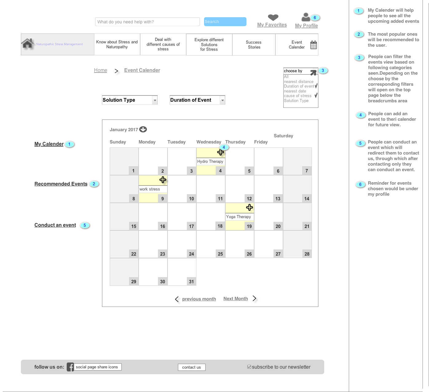
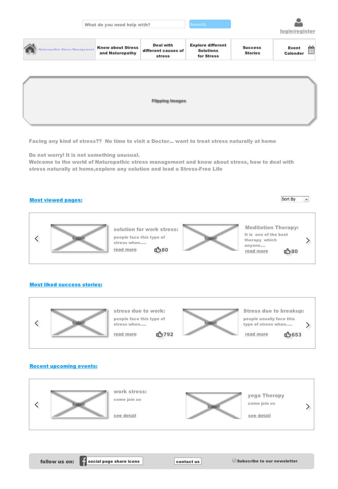
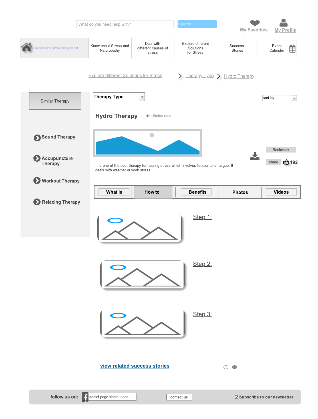
Wireframes – Naturopathic Stress Management