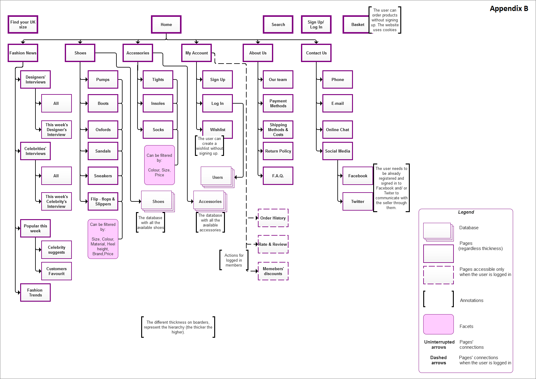
As part of Information Architecture’s coursework, I created a visual sitemap by using actual labels and different shapes and colours to represent the hierarchy. Then I used the open card sort procedure on optimalsort.com to test my sitemap and the labeling on it. Having the results of 8 individual users, I collected various information about the categorization I had used. The analysis of these data, helped me to fix the categories and improve the labeling. In the beginning “About Us” and “Contact Us” were together in the same group with title “Our team”. After the card sorting, I realized that it might be confusing for the users because of the different types of communication that were included into the same group. Specifically, the labels “Facebook” and “Twitter” were the hardest to categorize. As a result, I decided to separate them into the two different categories I mentioned above. The second important change that I applied after the testing, is related to the button “find your size in UK”. In the beginning, it was under the group “Our team” but most of the users answered that this element does not make sense to be in the same category with any of the other elements and as a result, I decided to put it separately.
Sitemap was created in Axure.
