After some weeks we learnt more about the design process and we opened our minds to new aspects. Each week we came up with new ideas of how to make the digital dosette box even better and useful.
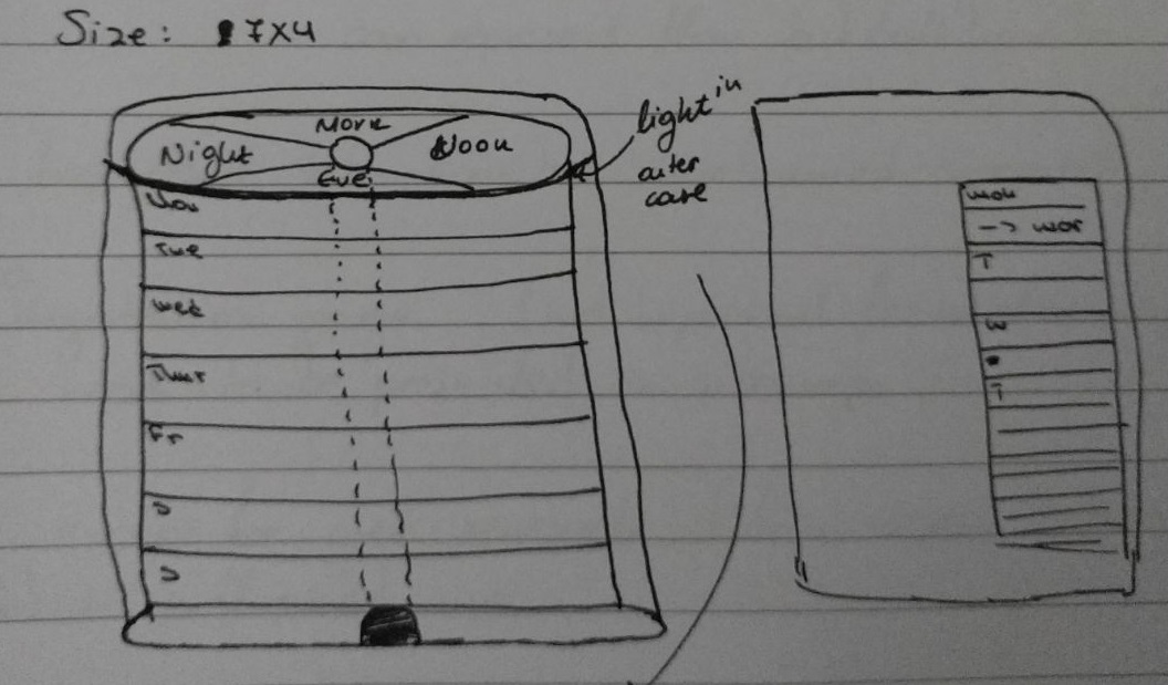
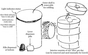
We tried to create a more “beautiful” dosette box to motivate the user even further. This time, the dosette box is divided vertically by “time” and horizontally by day. Each compartment is sizable and detachable for users who have a busy daily life and want to go out often. The outer case of the dosette box blinks softly as a visual reminder, when the user has to take a pill. When the pill is taken, the light of the outer case becomes solid. This dosette box could be a good choice for people who have a hectic social life.

