A recent meeting about risk communication at Birkbeck, University of London, entitled: ‘Talking Flooding: linkages between communication, risk and resilience in Flood-prone communities’ led me to think about risk and uncertainty. Although the day was focused on flood risk, it provided a useful insight into the way one particular sector deals with risk and some of the techniques that have been developed to represent risk and perceptions of risk. A presentation by Aidan Slingsby and Cagatay Turkay on ‘Visualisation and Uncertainty’ described different ways of representing uncertainty visually:
- Fuzziness
- Shading
- Colour bands
- Transparency
- Resolution
- Smoothness
- Continuity
Further reading identified two further methods:
- Lightness to signify uncertainty about the classification of a post code (Slingsby et al. 2011) or for projected values (Wong 2010, p.63)
- Sketchiness to signify the fact of uncertainty (such as future projections) rather than indicating the level of uncertainty (Wood et al. 2012)
There are several aspects of uncertainty which may be to do with the accuracy of the data, its precision, the degree of ambiguity and the level of confidence in the data. Where these can be represented numerically, they may be represented visually. Aidan has suggested that of these measures: “some may be considered more intuitive (high uncertainty being more transparent, less light, more fuzzy-looking, etc)”. Uncertainty may be due to poor data, an inappropriate model, or a poor understanding of the phenomenon being represented.
There is already an established visual vocabulary which is described by Bertin .(2011, pp.42–43) He identifies eight graphic variables which form the starting point for any discussion of visualization:
- Size
- Value
- Texture
- Colour
- Orientation
- Shape
- Two planar dimensions (2 variables)

Figure 1 – Bertin’s Visual Variables
We can use some of these visual variables to represent uncertainty. When we talk about risk there are two considerations:
- What is the probability of a risk event occurring?
- What is the impact of the risk event (consequence)?
In exploring the first of these we face two further questions: ‘How do we characterize a risk event?’ and ‘Are there established categories or do we have to develop a typology of our own?’ (Haynes & Robinson 2015). For example, if someone is browsing online what is the probability that they will enter a malicious site? Malicious sites could be defined by whether or not they are on a published list of known malicious sites. This is probably most meaningful across a large population so that different variables can be taken into account. For instance: frequency of online searches, online duration, experience, attitude to risk, whether or not there is anti-virus software on the device, operating system etc. Different population groups could be examined: nationality, age group, gender identity, socioeconomic group, educational attainment etc.
Estimates of the levels of occurrence of a particular risk event extrapolated to a general population would have an upper and a lower limit. These upper and lower estimates are likely to be imprecise and it might be useful to signal this visually. For example, in PowerPoint it is possible to generate a chart with a blurred effect:
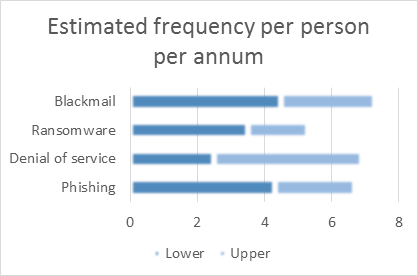
Figure 2 – Showing uncertainty with blurred outlines and shading
The lower range has been shown in a darker shade to emphasize the fact that it applies to the lower and upper limits of the estimate. The upper range is in a lighter colour, because it only applies to the upper range. An alternative might be to use texturing to indicate different levels of certainty:

Figure 3 – Showing uncertainty with texture
There is clearly further work to be done on presentation of results where there is a degree of uncertainty. A possible line of development might be to test different presentations of uncertainty to see how that would affect perceptions of risk.
References
Bertin, J., 2011. Semiology of Graphics: diagrams, networks, maps W. J. (translator) Berg, ed., Redlands, CA: Esri Press.
Haynes, D. & Robinson, L., 2015. Defining User Risk in Social Networking Services. Aslib Journal of Information Management, 67(1), pp.94–115.
Slingsby, A., Dykes, J. & Wood, J., 2011. Exploring Uncertainty in Geodemographics with Interactive Graphics. IEEE Transactions on Visualization and Computer Graphics, 17(12), pp.2545–2554.
Wong, D.M., 2010. The Wall Street Journal Guide to Information Graphics: the dos and don’ts of presenting data, facts and figures, New York: W.W.Norton.
Wood, J. et al., 2012. Sketchy Rendering for Information Visualization. IEEE Transactions on Visualization and Computer Graphics, 18(12), pp.2749–2758.


Leave a Reply