Designing an Information Architecture: Dietary Supplements Website

Standard

This project was submitted as part of the Information Architecture module of the HCI Design MSc and awarded a distinction.

Summary: I conducted interviews and online card sorting to gather IA requirements, designed an IA for a dietary supplements website featuring both products and content, and evaluated the IA through moderated user testing. Deliverables included: domain model, site map, user journey, and wireframes.

CAPTURING IA REQUIREMENTS

I began by conducting unstructured interviews with two domain experts: a regular consumer of dietary supplements (E1) and a clinical dietician (E2). I asked E1 to describe how he goes about finding DS and the types of information he looks for. He explained that he usually knows what kind of supplement he is after (e.g., iron) but not necessarily which specific product – this is often because he needs to find one that fits his preferences (vegan) from the available products. He sometime looks for recommended supplements for a specific health concern (e.g., immune support during winter) through a Google search, and enjoys trying new products as they might have better effect than previous ones.

The notion of what users want to know was complemented by the interview with E2, which taught me what users need to know. E2 stated that people need to practice consideration when consuming DS since misuse can lead to adverse reactions, and while combining certain dietary supplements can be beneficial for absorption and improving their effect, other combinations can hinder it. I aimed to reflect this complexity in my domain model:

domain-model-page-001

The high-level goal of the site was therefore allowing users to make a wiser purchase of dietary supplements and providing them with additional information that could benefit their health. Some concrete goals included:

  1. Ensuring that users can easily find products that match their dietary preferences and health-related concern, as well as discover new ones.
  2. Ensuring that the site supports their various information seeking behaviors in this context, including finding known items, exploring, and discovering new things.
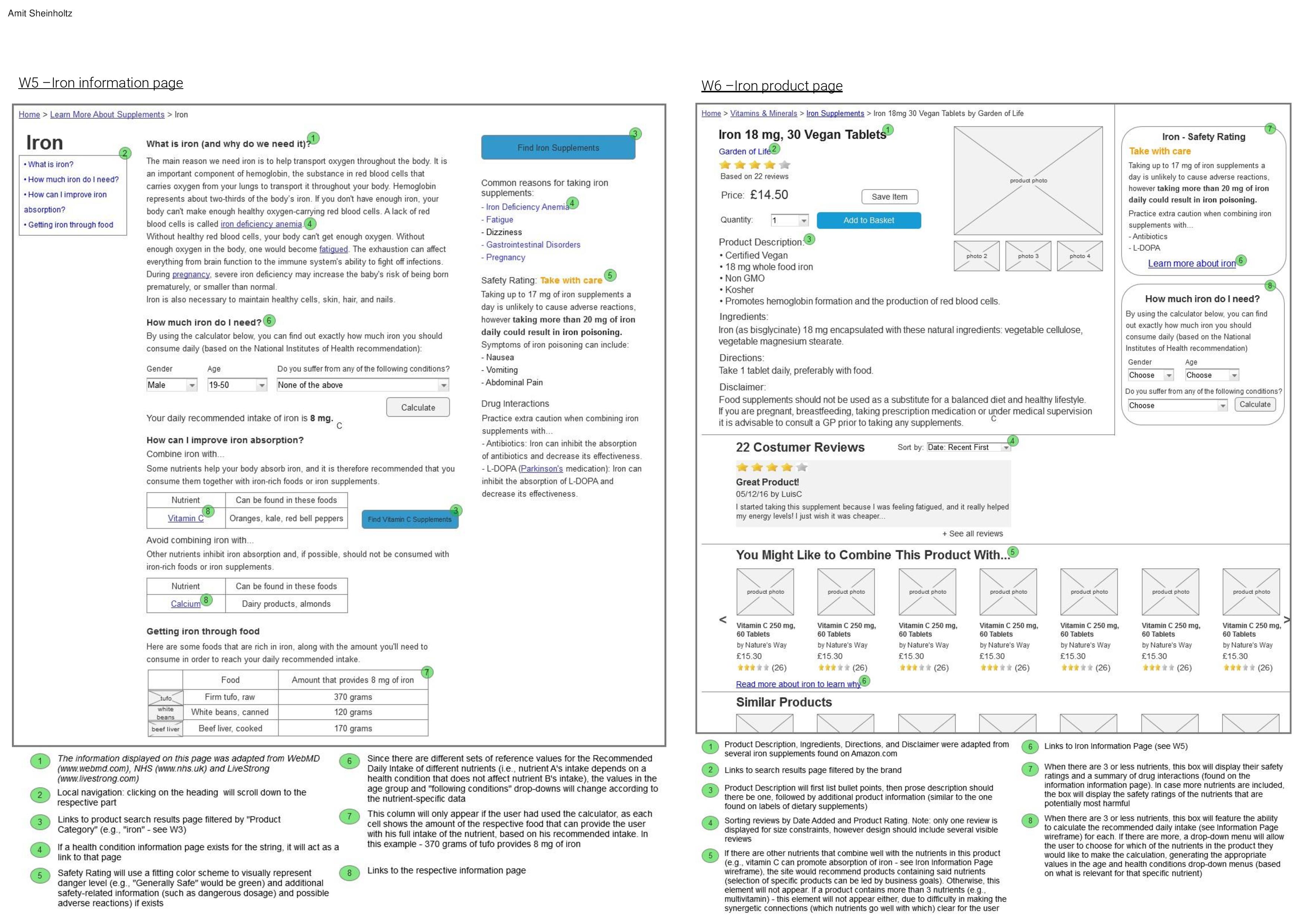
  3. Exposing users to vital information (including their recommended intake, safety issues, and good and bad combinations of dietary supplements).

IA DESIGN

I conducted an online card sort with 15 participants in order to gather insight on how this diverse information should be organized and labeled. It became apparent that the site needs to include different sections, some consisting of informative content pages and others of product pages. A combined IA pattern of simple hierarchy + simple database seemed to fit the complex situation, represented in the following sitemap:

sitemap-page-001

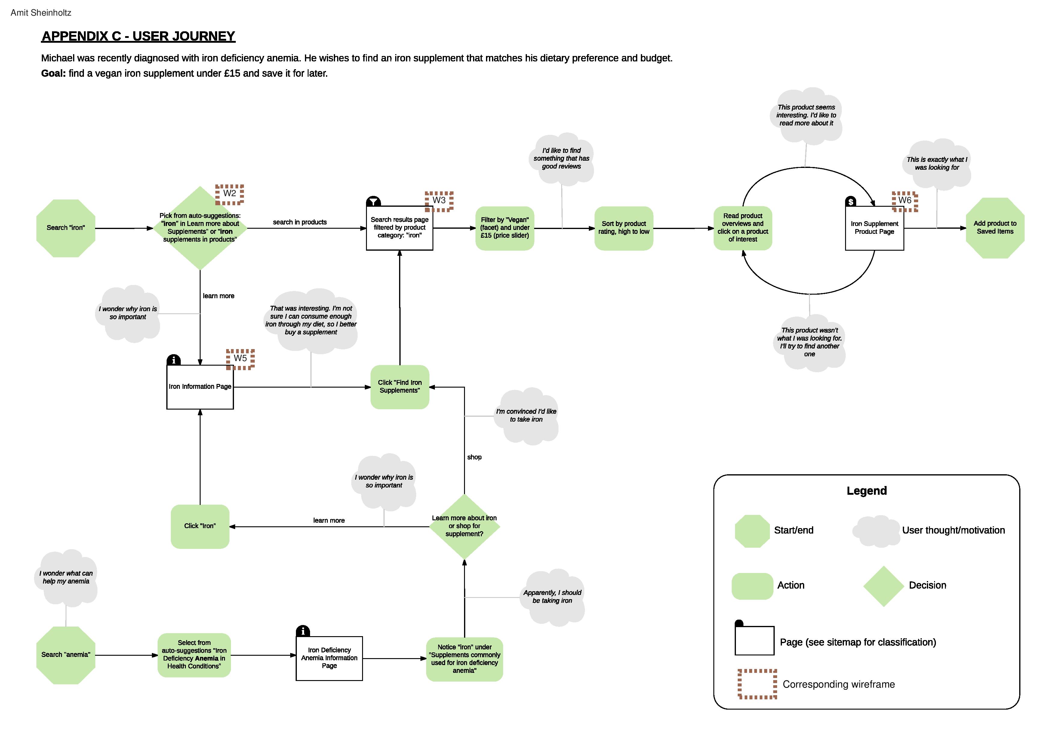
The following user journey illustrates how a user can find an iron supplement through a primary path (searching for iron products) or secondary/exploratory paths (searching for information about iron or about a related health condition).

user-journey-page-001

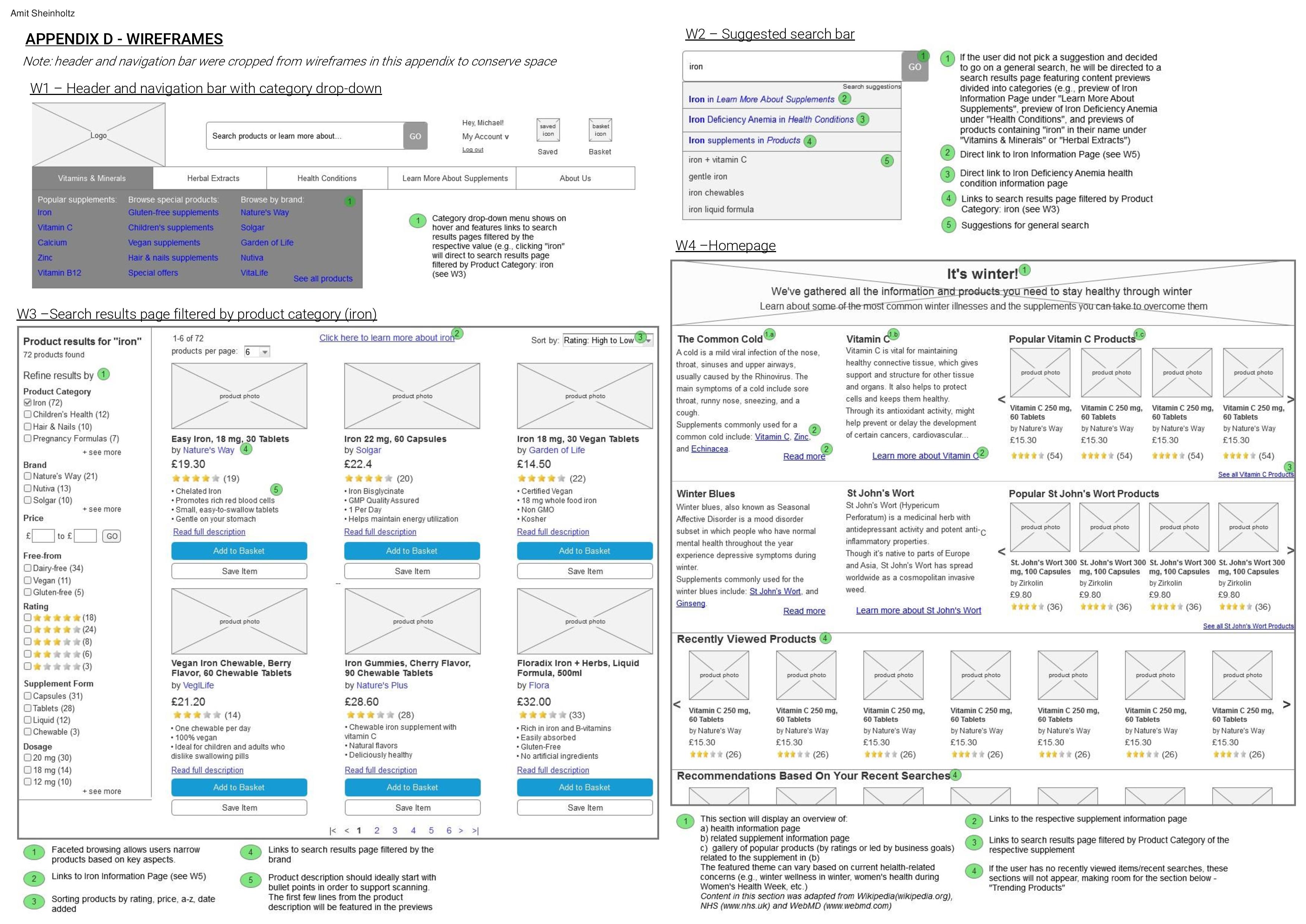
I drew inspiration from site like amazon.com and hollandandbarrett.com when creating the high-fidelity wireframes, namely for the labeling system and product page layout.

wireframes-page-002 wireframes-page-001wireframes-page-002

IA EVALUATION

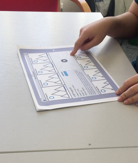
I conducted moderated face-to-face user testing with three potential users (who identify as consumers of dietary supplements) using the four static wireframes. Participants were asked to complete two findability tasks that follow the user journey while thinking aloud. They were also asked page-related and navigation-related questions when arriving at a new page (“What can you do on this page in your opinion?”) and before clicking on a link or button (“What do you expect to see after clicking?”). The last part of the evaluation included general questions about their experience, such as “Were there any titles or heading that were particularly unclear?” and “Did you learn any new information about supplements or their use?”.

Overall, participants were able to identify the available features and functionalities successfully. All three participants completed the tasks with relative ease, making use of either the search bar or the navigation bar.

A source of concern arose from P2’s feedback on the category labels “Vitamins & Minerals” and “Herbal Extracts”. She stated: “I wasn’t sure about the options on the left […] whether it would lead me to read about supplements or purchase them”. Since this finding can also reflect a bigger issue regarding site structure, moving forward I would first conduct further testing with more users to examine whether others feel the same uncertainty. Should it persist, I would tackle the labeling issue by conducting a closed card sorting with several variations of these labels, to identify the variation to which users most commonly assign product names. If the issue lies in site structure (having both information and e-commerce categories side by side), I would try to redesign the sitemap to follow a top-level task-based structure where users first need to select whether they would like to learn more about supplements or to purchase them.

Since the wireframes could not support independent and unstructured exploration, I unfortunately was unable to ask users to find a supplement or discover new information that was of personal interest to them – as they would do when using such a site in real-life use case. Having a richer set of wireframes about various supplements and health conditions would allow for a better evaluation of discoverability and findability.

THE CRAFT COLLECTIVE: Designing an app for the crafting community

Standard

This group project was submitted as part of the Interaction Design module of the HCI Design MSc and awarded a distinction.

Summary: The Craft Collective is an app for the crafting community, designed for tablets and large in-store touch displays. Users are able to publish craft projects, upload tutorial videos, communicate with fellow “crafters”, and share their creations. Our group conducted user research through observations and interviews, gathered requirements and created personas, storyboards, and low-fidelity wireframes which were evaluated by conducting moderated user testing.

(Collaboration with: Julie Hobson, Cansu Sayici, and Nick Willis)

BRIEF & OBJECTIVES

We were asked to design a tool for the creation and curation of digital content, tailored to a specific community. Our group chose to focus on the arts and crafts community, which consists of people who use their creativity to create beautiful artifacts as a hobby (“crafters”). We aimed to provide crafters of all technological abilities the opportunity to engage in their crafts, learn new skills, inspire others and be inspired.

USER RESEARCH

In order to get acquainted with our community, we visited a well-known arts and crafts store in central London. After observing how costumers approach craft supplies and interact with sample projects in-store, we went on to conduct several structured interviews, asking willing costumers about finding inspiration for potential projects, sharing their finished products, and other aspects of the hobby. Later, we conducted in-depth, semi-structured interviews with 5 participants in order to explore the questions that arose while discussing our preliminary data.

PERSONAS

Based on our findings, we created two personas that would reflect different levels of our potential users’ core attributes: motivation for crafting, tech skills, crafting skills, and frustrations. Meet Amber and Alice:

amberaliceThe personas were extremely instrumental: They provided us with a “common language” (by referring to Alice or Amber, other teammates knew exactly what type of user is being addressed), helped us to establish functional requirements for the app based on user needs, and encouraged us to agree on specific design goals.

DESIGN GOALS

  • Exposing crafters to inspiration for new projects
  • Allowing them to share their finished craft
  • Showcasing different interpretations of the same project
  • Utilizing the physical space of craft stores to complement the digital experience

REQUIREMENTS

With our design goals and users in mind, we continued to establish requirements. Doing so was both crucial to our design process, as well as a great team activity: using a whiteboard enabled us to collaborate, engage in a discussion, and create a common vision.

requirements

Gathering requirements

Among the the requirements were:

  • A craft project may consist of instructions, supplies, pictures, difficulty rating, and links to other content [So that users are shown exactly how a craft project can be constructed, and can make a judgment about how hard it will be to complete].
  • The system will allow a user to post a request for information or advice [So that users can benefit from the craft community, get feedback on how their project could be made, and to foster a sense of community].
  • The system will allow the user to visualize their craft in-situ [So that they can gain a clearer picture of how their craft would look in their home]
  • The system shall allow the upload of the 360 degree photos via in-store cameras or an in-app feature [As a means of supporting the holistic visual experience]
features

Key features (representation by Cansu Sayici)

STORYBOARD

Moving into the conceptual design phase, we created two storyboards featuring the user journeys for our two personas based on two representing scenarios. The storyboards were instrumental for shaping our early sketches and setting a clear context for our upcoming work.

future-storyboard

future-storyboard2

Representation by Cansu Sayici

SKETCHING

Baring our users, features and context of use in mind, we began sketching, experimenting with different screens and layouts. We discussed various sources of inspiration (for example, Pinterest and its visually-enticing layout), created sketches of different fidelity levels, and shared out thoughts on each other’s designs. We aimed to sketch as much as possible without over-thinking, which really helped to drive our creativity.

capture

WIREFRAMING

Stepping into the detailed design phase of our project, I created several low-fidelity wireframes based on our sketches using AxureRP. When wireframing the Craft Project Page, I aimed to enrich it with realistic content in order to make it “alive” and elicit more insight during future evaluation.

The design of the wireframes was led by several guidelines we came up with, to create an intuitive, holistic, and artistic experience:

  • Turning to gallery pages of popular services such as Google Images and Netflix for inspiration, to leverage users’ previous interactions to facilitate a sense of familiarity with our system.
  • Making the experience as visual as possible, emphasizing project pictures and minimizing text.
  • Minimizing navigation and maintaining the majority of the interaction on a single screen to create a seamless experience and allow users to stay within context.
  • Display information about materials and instructions using a cookbook metaphor, as people are used to finding this kind of information side-by-side in that context.

Browsing screen

Browsing screen with expanded project

Project page

EVALUATION

The last phase of our design process was conducting moderated user testing using our wireframes. We employed a “wizard-of-oz” method, taking turns in being the facilitator, moderator, or documenting the process via video capture (only the prototype and users’ hands were captured in order to maintain anonymity).

5 participants volunteered for the evaluation, all female over the age of 18. After getting their consent, participants were presented with a simulated task:

You are in the ceramics aisle of the craft store, looking for your next project. You really want to do something that would look good in your house (picture provided) and you only have about four hours to do it. Using the browsing system, find a craft that you would like to do and save it to your account”.

Following the contextual inquiry approach, participants were asked to think out loud, and were occasionally asked questions during opportunistic moments (for example, “What would you expect to happen once you click this element?”).

Participant’s interaction with the paper prototype

Overall, the evaluation produced positive feedback, and participants reported that they enjoyed the simplicity of the interface, the navigation system, and found the special visualization feature (In My House) useful. The most constructive feedback was regarding the project page: all participants struggled with the Send and Share functionalities, as they were not sure about the differences between the two. Some users sought an easier way to view reviews and previously captured In My House images.

In our next iteration, we would likely unify those functions in one button, as several common social media platforms do. Furthermore, we could use a tab system in the notebook to allow users to view the different content without having to scroll down.

A major limitation of our evaluation, however, was relying on younger participants (mirroring our primary persona). Further evaluation with older users (mirroring our secondary persona) is necessary for future evaluation.

REFLECTION

The Craft Collective project was extremely educational, which I contribute to several reasons:

  • The workload enabled each of the team members to experiment with different roles throughout the research and design process.
  • We enjoyed a great atmosphere of collaboration, mutual-fertilization, idea support and constructive criticism.
  • We dedicated plenty of time for divergent thinking, which produced some novel features and enabled us to maintain a playful attitude throughout the process.