This project was submitted as part of the Evaluating Interactive Systems module of the HCI Design MSc.
Summary: I conducted user testing of the Cancer Research UK website with four participants who engage in charitable activities. The evaluation focused on the homepage, fundraising, and shopping sections (following the concerns described in the brief), and consisted of a “get it” test, key-task tests, and open-ended questions. Data collection relied on observations and think alouds, and key metrics including Single Ease Question (SEQ), success rate, and time to complete. Participants correctly identified the available options on the homepage, and reported they enjoy its clean layout, yet some mixed reviews were made regarding a commercial tone and the overwhelming amount of information.
Four emerging usability problems were identified, three of high severity (redirecting users to sub-domains, rigid search functionality, and misleading shopping categories) and one of low severity (lack of expected functionality in the shop locating feature). Issues with the website are presented, and recommendations for possible changes are provided.
THE BRIEF
The coursework brief described the “client’s” concerns as follows:
1. Cancer Research UK would like to know what people think of the homepage: what message is the homepage delivering to users, what is going well here and what could be improved?
2. There are some concerns about the usability of the fundraising events and shopping sections. Cancer Research UK would like you to investigate and report your findings.
EVALUATION METHOD
I sought to recruit participants who have been involved in charitable activities (e.g., donated money or volunteered for a charity) in the past 6 months, to ensure the evaluation is conducted with representative users. I posted a call for participants on several cause-driven Facebook groups of City, University of London student societies to increase likelihood of reaching participants with philanthropic inclinations. Four individuals were able to commit to the testing times.
A pilot study was conducted prior to the evaluation sessions. Iterations were made based on the pilot, including some wording and the recording software.
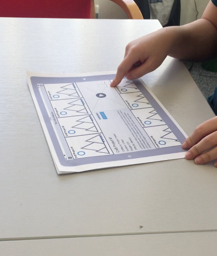
To improve standardization and minimize omissions, I created a test script. Sessions were held in a library group study room to ensure a quiet environment, and furniture was rearranged so that participants will be facing the wall to minimize distractions. Session duration ranged between 36-54 minutes (M=44.5). Open Broadcaster Software (OBS) was used to record the screen and the session audio. Recordings were later reviewed during qualitative analysis. Participants were given a booklet containing the scenarios, tasks, and open-ended questions.
TASKS
The shopping and fundraising sections were explored to sample available information and functionalities, in order to establish tasks that align with the client’s concerns. Since the sections consist of both functionalities (e.g., purchasing an item) and information (e.g., how to organize a fundraiser), the established tasks included both verb-based and scavenger hunt tasks.
It was ensured that all tasks can be accomplished using the website, and efforts were made to use wording that will not lead participants (e.g., “charitable event” instead of “fundraiser”). Six scenarios and tasks were established in total, asking participants to:
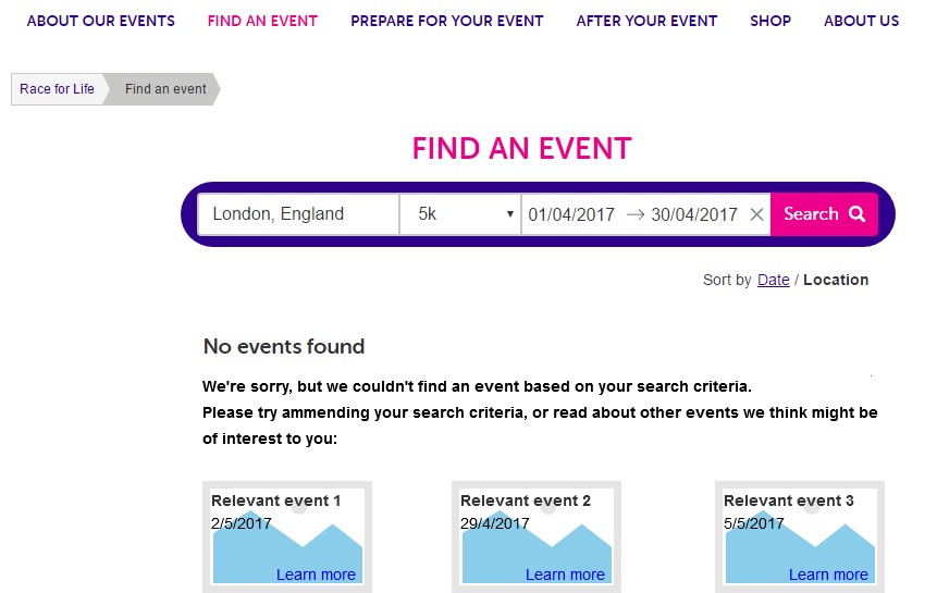
- Find a Cancer Research UK 5k run in London next month
- Register interest in this year’s Dryathlon challange.
- Order a fundraising inspiration pack.
- Purchase a statement shirt from the online shop.
- Locate their nearest Cancer Research UK shop.
- Make a donation for lung cancer.
EVALUATION PROCEDURE
- Briefing: Participants were given an overview of the session, information sheet, and consent form.
- Background questionnaire: Participants completed a questionnaire about their demographics, internet and computer use, and charitable activities. The questionnaire was built using Google Forms intentionally, so that participants could familiarize themselves with the testing laptop before attending to the website.
- “Get it” test: Participants were shown the Cancer Research UK homepage and asked some questions (including whose site they think it is, what strikes them about it, and what they can do there). The aim was to examine whether participants can correctly identify the website’s domain (charity), the charity itself, and the options available on the homepage.They were then invited to list anything they like or dislike about the homepage.
- Key-tasks test: Participants were asked to complete the six tasks while thinking aloud. Task order was randomized between participants to counter-balance the effects of familiarity with the website acquired from previous tasks.
- SEQ: After each task, participants were asked to rate it using the Single Ease Question (SEQ), a simple 7-point Likert scale which measures task difficulty.
- Open-ended questions: Lastly, participants were asked to write down the best and worst aspects of the website.
FINDINGS – HOMEPAGE
Three of the four participants were unfamiliar with the website, and could easily identify that it is related to charity. P4 and P3 shortly noticed the logo and identified the charity as well. P1 was the only participant who could not name the charity. All four participants were able to get a correct impression about the available options on the page by briefly exploring it.
P2 had nothing negative to say about the homepage, whereas P4 stated she did not like the homepage at all. Three participants enjoyed the clean visual design and page layout, saying “Nice clean layout (…) as a photographer, I think the photos are nice” (P1), “I like that it’s basic. [I like] the white background” (P2), and “White background, clear color combination… Looks very clean” (P3).
Two participants, however, had negative comments regarding the amount of information on the homepage, stating: “It’s a bit busy (…) a lot going on. You need to read all the headings before you can understand what it is (…) Normally, the images would have an icon that tells you what you should expect” (P3); “I see so many things (…) It would be nicer to be taken on a journey with one simple message” (P4).
Furthermore, two participants expressed their dissatisfaction with the homepage’s emphasis on money, saying “It bothers me that they go straight to money. Looks very commercial (…) “Donate” appears twice. Why not ‘help’? ‘Donate’ and ‘Shop’… it’s too much” (P1), and “I don’t like that it’s telling me to donate twice. It’s like I’m stupid and I missed the button (…) They don’t need to try so hard. If I want to donate and I’m here I will donate” (P4).
In conclusion, the homepage successfully communicates the charity’s identity and provides users with a good overview of the available features and opportunities. While most participants found its visual design pleasant, some perceived the amount of information as overwhelming, and the tone as overly concentrated on money.
FINDINGS – TASK PERFORMANCE
The following table summarizes the success rates, task completion time and time to failure, and SEQ ratings by task and participant:
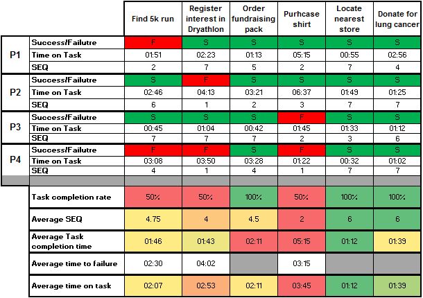
All participants successfully located the nearest Cancer Research UK store, donated for lung cancer, and request an inspiration pack. The last two were also perceived, on average, as the easiest tasks (SEQ=6). Half of the participant were unable to complete the other four tasks. Finding and purchasing a statement shirt from the online shop was by far the hardest task (SEQ=2), and took significantly longer to complete than all other tasks (5:56 minutes).
USABILITY ISSUES
1. Redirecting users to the Race for Life sub-domain
High severity: the issue affected 3 participants, led to task failure and disorientation.
Links that redirect users to the Race for Life sub-domain (https://raceforlifeshop.cancerresearchuk.org) are present in several areas, including within the navigation dropdown menu. Three participants clicked on a Race for Life link during two different tasks (searching for a 5k run and purchasing a shirt), and did not realize they were redirected, presumably due to the visual similarity of the Cancer Research UK and Race for Life websites, and the lack of appropriate feedback. Participants continued interacting with the Race for Life website under the wrong assumption, resulting in task failure.
For example, P1 and P4 searched for a 5k run in the Race for Life website (which includes only Race for Life events). Upon receiving zero results, they concluded that there are no 5k runs in London next month (although a fitting event does exist in the events section of the main Cancer Research UK website).
As the upper left logo links to the Race for Life homepage, participants were unable to independently go back to the Cancer Research UK homepage. Both P1 and P4 expressed disorientation, and P4 was the only participant that noticed the change, saying “The page changed. It wasn’t this page before […] as if it’s a different homepage”. When asked if she knows where she is, she replied “No. I thought I was on the homepage because I clicked here on the logo. Was I not on the homepage before?”.
Users who unknowingly stumble into the Race for Life sub-domain may not be able to find the event, product, or information that they seek, which can result in suboptimal participation and purchases. Furthermore, they may not know how to return to the main Cancer Research UK website, resulting in disorientation, frustration, and giving up altogether.
2. Rigid search functionality
High severity: the issue affected 3 participants, led to task failure and frustration.
The search functionality did not perform well in connecting participants with relevant information. Both P2 and P4 tried to find the Dryathlon by searching for the keyword “alcohol” and received zero results, resulting in task failure, despite the fact that “One month. No alcohol” appears as one of the taglines for the challenge. P3 typed “shirt” into the site-wide search at the top of the page and received a long list of results, none of which was a direct link to an actual product.
Due to its shortcomings, users who prefer to search directly for the event or product of their interest may not be able to discover it, further compromising participation and purchases.
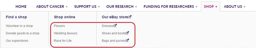
3. Misleading shop categories
High severity: the issue affected 3 participants, led to task failure and frustration.
When trying to purchase a shirt, two participants looked for a “t-shirts” category in landing page of the online shop link, and deducted that the shop does not offer any. While browsing the categories on the left navigation bar, P2 noted: “This isn’t very helpful. It doesn’t give you any categories at all. Just accessories” and P3 abandoned the task, saying “I don’t see t-shirts”.
The issue is also evident in the “Shop” drop-down menu, which does not feature a “More…” link, unlike other the dropdown for other categories, making it appear as though these are the only product categories. P4 expressed extreme frustration before abandoning the task, saying “I’m inside shop and there’s a store, but it doesn’t have shirts. I mean, they were so specific about everything else, they would say if they had shirts as well, right? So they don’t. I don’t know what to do. I’m lost. I wouldn’t buy the shirt“.
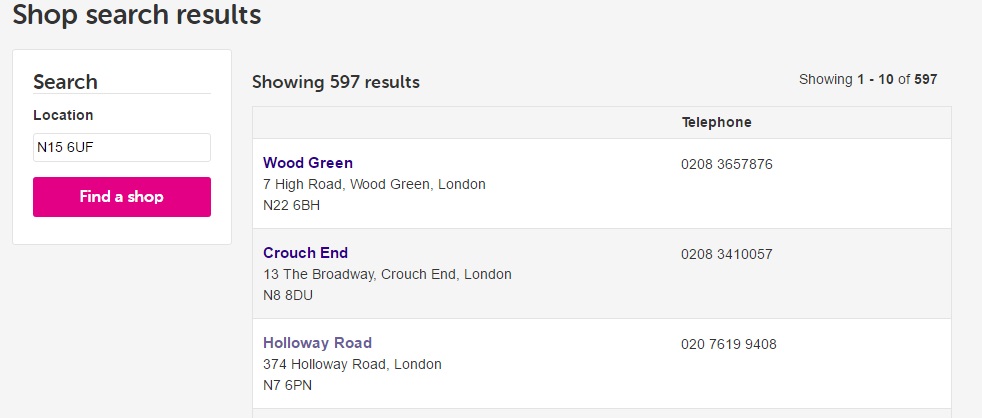
4. “Find a shop” lacks expected information and functionality
Low severity: The issue was explicitly addressed by 3 participants.
Although all participants managed to locate a Cancer Research UK shop near their home, three expressed uncertainty regarding the way in which results were listed, namely since they lack a frame of reference, for example the distance from the typed in postcode. P3, who at first was unsure if she could search by postcode (“it only says location”), noted “It doesn’t tell you how far it is in terms of miles“. After locating her nearest shop, P4 said: “It would be nice to have a Google Maps there […] if I don’t know where the street is I can go in the map and see”.
Users may have existing expectations when interacting with location-based search, as a result of their experiences with services such as Google Maps. In addition to the practicality of providing a clear frame of reference for shop results, aligning with users’ expectations can lead to a more natural and intuitive user experience.
RECOMMENDATIONS
The following recommendations aim to address some of the usability issues and comments made by participants. Several low-fidelity mockups are included for demonstration purposes, but are by no means the single correct implementation. The content, as well as the execution, should be adjusted to align with Cancer Research UK goals and guidelines.
1. Links to sub-domains
Links to sub-domains, including the Race for Life and the online shop (shop.cancerresearchuk.org) should open in a new window or tab, to inform users that they are interacting with a different website. Alternatively, the sub-domain can open in the same window, yet a clear feedback should be provided (e.g., “You are being transferred to the Race for Life website”).
Since both the logo and the home icon on these sub-domains link to the sub-domain’s homepage, it is vital to provide users with a clear link back to the original Cacner Research UK homepage. The link could appear above the sub-site logo, signaling the parent-child relationship between the pages.
2. Reviewing the information architecture
Participants often complained about feeling lost within the website, and expressed uncertainty about the possible location of information and the differences between similar labels (e.g., “Shop online” and “Our eBay store”). Overall, participants seemed to lack an intuitive feeling of where they should go. In their comments about the worst aspects of the website, P1 wrote “Things weren’t very clear sometimes. Like the shop – there are different shops and it’s messy” and P4 described how “The build loses its simple purpose in the sense that it makes a simple message get lost in repetition, noise, and excess information”.
It is therefore highly recommended that the website’s information architecture undergo re-evaluation, including the navigation structure, product categories, and use of labels. Conducting card sorting and tree-test exercises with representative users can help clarify how users naturally categorize, label, and associate the various types information available on the website. Restructuring the information based on the acquired insight can potentially help users find information, including events and products, that fit their needs.
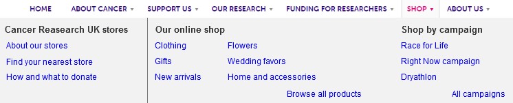
An alternative Shop dropdown menu
3. Improving search functionality
It is crucial that the website’s search engine be improved, so that users can find information even if their query does not match an item exactly. This should include implementing a “Did you mean…” functionality in case of misspelling, in addition to providing users with suggestions they might find relevant as well (based on keyword similarity or analytics data regarding common user journeys) in cases of zero search results. This would help to increase users’ exposure to other events and products, extend their time on the website, and minimize potential discouragement.
Alternative zero search results page
4. Iterating the homepage
Participants enjoyed the clean layout of the homepage, yet comments were made regarding the overwhelming amount of information and focus on money. An alternative version of the homepage might display less information in parallel (for example, by changing the underlying grid), and feature a visible testimonial and friendlier microcopy that communicates gratitude and facilitates a personal rapport with the user.
In order to increase engagement, fundraising events can be displayed on the homepage, for example by providing an events calendar, and adding a call-to-action button for organizing an event.
If the homepage is redesigned, it is recommended that the original and new versions undergo A/B testing to measure whether the new design accomplishes the set goals (for example, by comparing event registration rates).
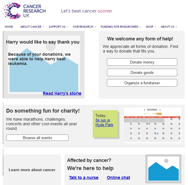
Alternative homepage layout
5. Improving the shop locator
By displaying near Cancer Research UK shops on a map and providing relative distance from the input address, users could locate their nearest shop and plan their visit more easily. This may also align better with their expectations of location-based search, improving users’ experience with the feature.
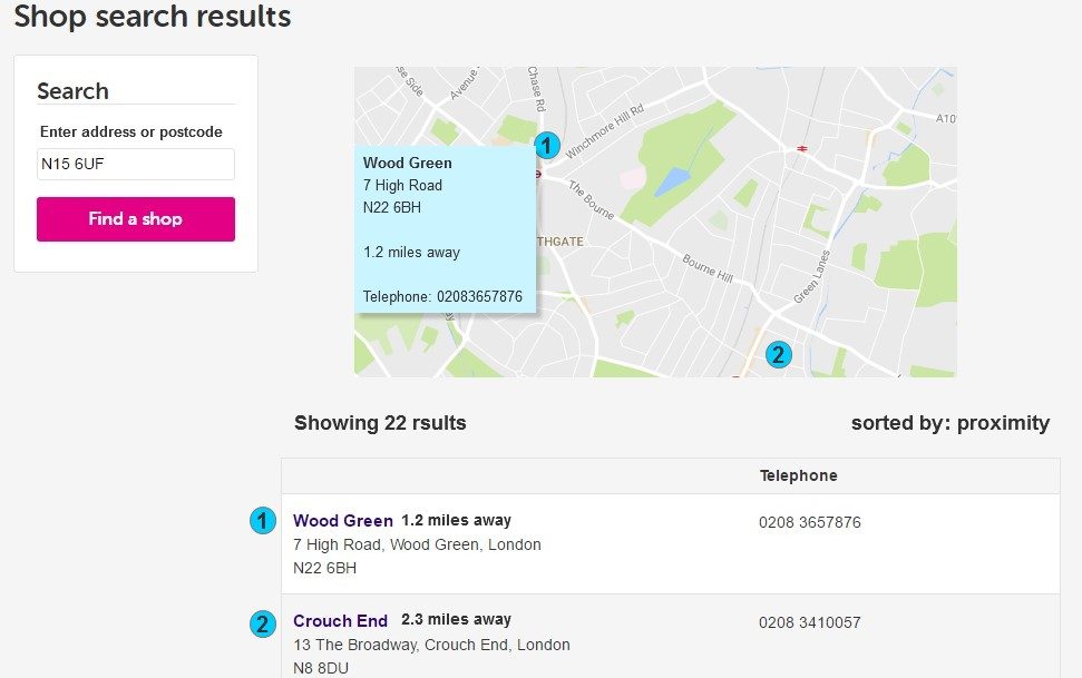
Alternative shop search results
6. Re-evaluation
Lastly, should any changes be implemented, it is recommended that the new version be evaluated using the aforementioned findings as a base of comparison, in order to measure the effectiveness of the changes.