In just over 2 weeks time, I will be presenting like I have never presented before. Never before have I had to follow conference rules on what presentation tool to use and more importantly HOW TO USE IT!
I will be forced to use PowerPoint slides, which may not sound too radical to some people but recently my use of PowerPoint has been limited as I have developed a fondness for the open canvas and zooming abilities of Prezi.
However, my greatest fear (no exaggeration!) comes from the limitation on how I should present, more specifically, I have to convey my message in 20 slides with each slide automatically changing every 20 seconds thus giving me only 6 minutes and 40 seconds!
In case you missed that and didn’t understand ( I don’t blame you) here is a breakdown of my anxieties:
1. I will be presenting at the Creativity and Engagement in Higher Education conference where delegates will explore and discuss international best practice in teaching and educational research in higher education to identify creative models for engagement in a shifting educational landscape.
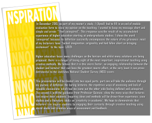
2. My presentation, co-authored with Professor Susannah Quinsee is entitled “How my lecturers Uninspired me: A student’s recommendation on creativity and engagement”. This presentation draws on my 6 years of student experience in higher education which includes a BSc and MSc, as full-time and part-time student across two Universities; coupled with a literature study of how to engage students in the classroom through the latest innovative learning methods.
3. We will be presenting in a format called Pecha Kucha. The name draws its name from the Japanese term for the sound of “chit chat” and it rests on a presentation format that is based on a simple idea: 20 images x 20 seconds. This is where the root of my concern lies. I am grateful for having the opportunities to present many times in the last few years and my core philosophy is that the presenter should be in control of the slides. With Pecha Kucha, the slides are in control, you have 20 seconds to say what you have to say otherwise you will look a little silly chasing your slides.
Pecha Kucha was originally devised in Tokyo in 2003 for an event for young designers to meet, network, and show their work in public. At its core, the purpose of Pecha Kucha is to make presentations that are concise, and by keeping things moving at a rapid pace it prevents ‘death by PowerPoint’. I have had to sit through some very BORING presentations (in class and conferences) and for this I applaud this format BUT will it work for a higher education conference?
 The last (and only) time I have seen Pecha Kucha being used was in a London conference in 2009 and the strongest memory I have is watching the presenter, in an act of frustration, exit the PowerPoint slide-show, go into the animation section and turn off the timer. I think the whole 20 seconds thing got to her!
Just to make my point clear, have a look at this video on “How To Become A Pecha Kucha Superstar” – doesn’t he look a little awkward waiting for the slide to change? I think he does, at one point having nothing to do as he waits for the slide change, he scratches his leg under the table. AND this is someone who has presented in this format many times!
Nevertheless, I cannot really criticise Pecha Kucha unless I test drive it and you never know I may come back from Salford, Mancherster really loving it. This article from Wired Magazine shows that Pecha Kucha has the potential for enabling short and sweet communication. We will see!
Ajmal Sultany
Research assistant [LDC]
Follow me on Twitter


June 20, 2011 2:52 pm
We had a bunch of Pecha Kucha presentations at the recent NAIRTL conference in Ireland. Some presenters were definitely more comfortable with the format than others. The better ones seemed to deliver a verbal presentation that happened to have complementary slides appearing behind them every 20 seconds. That way there weren’t any awkward pauses while a presenter waited for a slide to advance. And it seemed to work best when those slides were largely visual, with few if any words. Including different types of visuals (photos, diagrams, one-panel cartoons, and so on) seemed to help, too.
Good luck!
June 21, 2011 9:50 am
Hi Derek,
Thank you for your contribution, I appreciate it.
I am working along the same lines, where by I am creating my slides visually. Normally I try to be visual but now I am completely stripping out as much text as possible. Nevertheless, I will need to do a lot of work on getting the timings correct.
Ajmal
June 24, 2011 11:20 am
Ajmal,
I did a Pecha Kucha last year at the Eabis experiential learning workshop, mentioned at http://martinrich.wordpress.com/2010/11/29/postcard-from-berlin/ . Like you, I was a bit nervous about the format, in my case because my usual mode of working with PowerPoint is to have a small number of slides, as a storyboard, and quite often to put the presentation on one side and just talk to the audience in between slides. So being pushed on repeatedly to a new slide after 20 seconds does feel quite uncomfortable at first. But it is a useful exercise, partly because it forces you to focus on the key issues associated with each slide, partly because it gets you to think about what images to use most effectively. And it does repay rehearsal: my Eabis presentation was based around several trial runs at home the evening before leaving for the conference.
Good luck
Martin
June 24, 2011 5:48 pm
Hi Martin,
Thank you for your contribution, I really appreciate it.
Yes, I am having a very similar experience as you, guess I am not alone! I have created my slides now and you are right everything is more compact. Once the conference is done, I will blog my experience here.
Ajmal