A background can make or break a video interview or presentation. If the background is too fussy or colourful, the subject can be lost in a sea of confusion and it can produce an uncomfortable viewing experience. The general rule of thumb is to make the foreground stand out from the background and this can be achieved in a number of simple ways:
- Blur the background. By increasing the size of the iris (or f-stop) on a camera lens, backgrounds can be blurred out, producing a very nice visual feel to your images. A downside is that the depth of field (range of which things are in focus) is also reduced meaning if your subject moves slightly forward or backwards, they can go dramatically out of focus.
- Use a plain or uncomplicated backdrop. This could be a neutral-coloured wall, patterned background or simple room arrangement. Sometimes if the background is too simple (say a magnolia wall) it can make the scene a little boring to watch, so it’s often advisable to add a little spot lighting on the background to create more interest.
- White background. This ‘clean’ look is used to great effect by the likes of Apple for their showcases. It gives a very professional, ‘infinite space’ look to interviews and makes the presenter really stand out. When done properly, it can look fantastic but it’s quite hard to get right.
Getting the perfect white background look
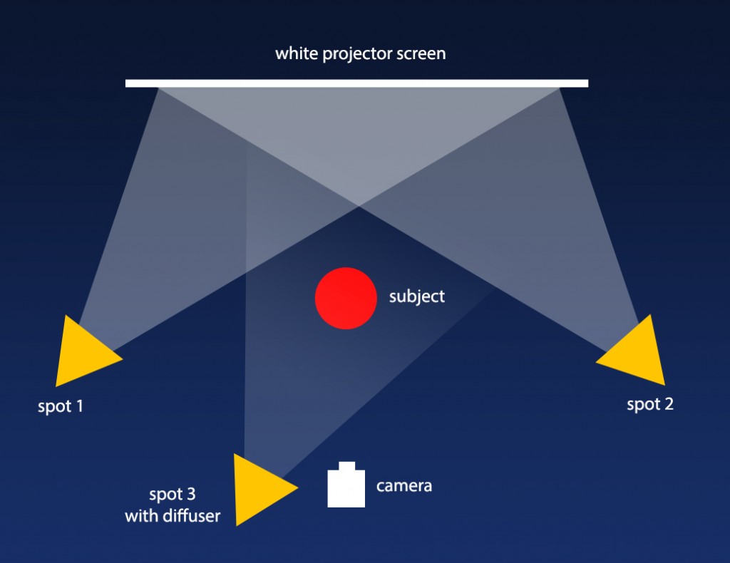
In the MILL we use the following arrangement for white-background shots…
We use a portable projector screen to provide the white background, which is lit from both sides using spotlights. The projector screen is placed well behind the subject reducing the risk or any shadows. It also gives enough room for the spots to light the background without hitting the subject. A third light is used to light the subject, with a piece of greaseproof paper to act as a diffusing filter. This reduces the harshness of shadows on the face and leads to a more pleasing look.
The aim is to have a neutral white background whilst having a well-lit subject. This is almost impossible to do with a camera set on auto exposure. What tends to happen with auto is that the camera adjusts its exposure for the bright backdrop leading to a dull, yellowy background and very dark subject. Any slight shadows on the backdrop also show up leading to a very poor result.
The trick is to place the camera on manual exposure. This way, the exposure on the camera can be raised to the point where the background burns out to pure white, removing any shadows and giving a completely white look. This point can be easily seen on an exposure meter on the camera. The spot light used to lighten your subject can then be adjusted in intensity to give the perfect look.
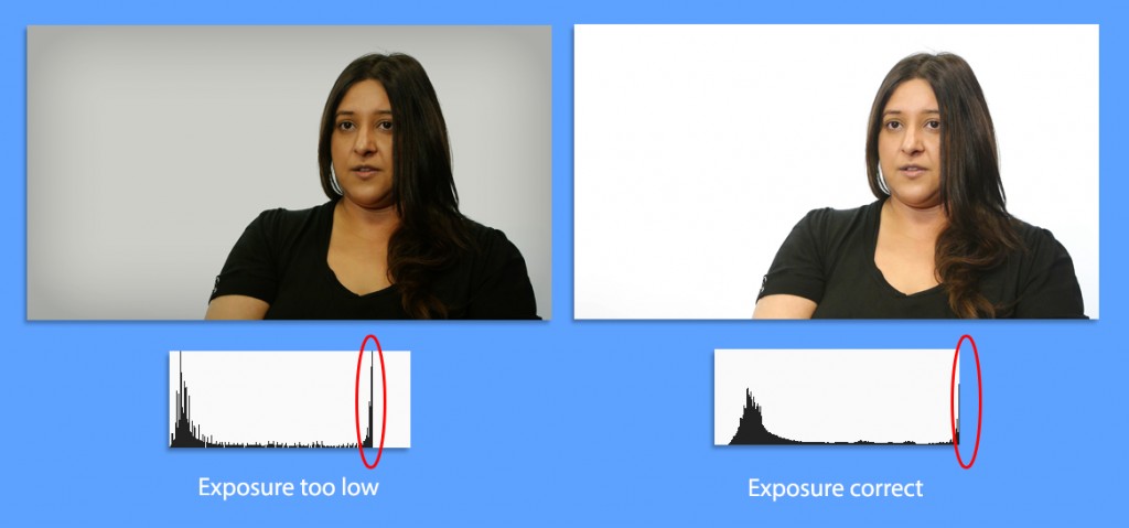
LEFT IMAGE: The large peak (circled red) represents the brightness of the white projector screen. The exposure is not high enough and the background appears dull.
RIGHT IMAGE: By increasing the exposure, the large peak shoots off the scale and the background burns out to pure white.
Because lights tend to have a yellow-tint, it’s also advisable to change the colour balance of your camera to take off some of this colour. This is becoming less of an issue with the introduction of very neutral LED lights.
The process takes a bit of trial and error to get right but the results can be very effective. If the exposure is a little off, it can be corrected in post production by using a levels filter.
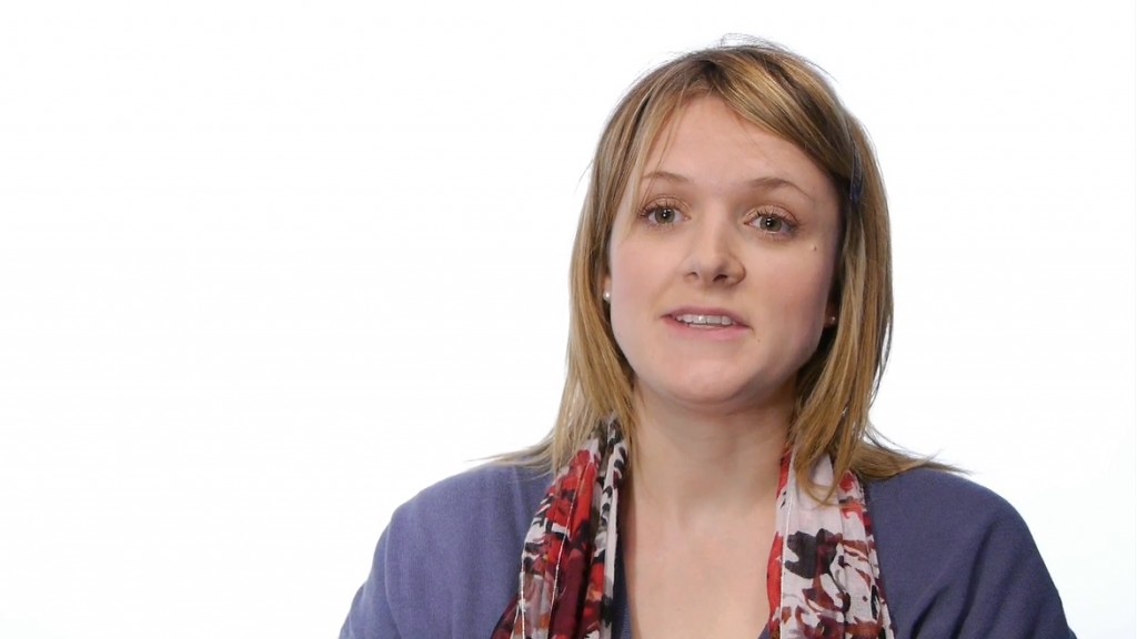
The plain white can be used as is, but it also acts as a good canvas for adding titles or logos to accompany the speaker. This was used to great effect in a set of videos for the careers department at City.






Leave a Reply