In a recent research visit to The Aalto University of Helsinki’s Design Factory my aim was to research and explore innovative learning space ideas that could be incorporated in to the vision for the new multi million pound building project at City University. Here I am posting about one particular learning space that is innovative, practical and upholds their student centred pedagogy.
The space background
Called “The Stage” this is a flat learning space for up to 100 students, it was not purpose built but is a visionary re-design, on a low budget, of an existing space previously used by the Engineering School. Double height, with no windows, an upper viewing gallery, and with ban on altering any existing structural features, it almost entirely replicated the existing Sports Hall space in the basement at Northampton Square.

Student involvement in the design
Students at The Learning Factory are drawn from different Schools, including Engineering, Informatics and Product Design Development. At Aalto the student voice matters and the ethos is to give students the power to envisage and co-design the learning space they need. And then to fully support the realisation of that space. Students must of course fully justify their design ideas.
Design Features for The Stage space
- completed on a very low budget
- No existing load bearing structural features have been altered
- any existing features have been mined for their collaborative and situational learning potential: the existing open gallery has been glazed and transformed into three seminar rooms
- audio visual -there are three screens, two at one end of the space, and one at the opposite end. There is a state of the art sound, computer, and audio desk.
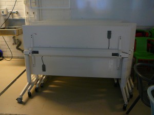
- furniture – Low cost bright, attractive and tough stackable IKEA chairs, plus easily moved white tables on wheels, that can be folded down, taking up little space when stored
- lighting – a theatre type flexible lighting rig that can be used for a multitude of purposes.

Rationale
This is a multi-use learning space. Teachers can easily configure the space for their particular learning session needs: lecture, interactive class session, or a combination. The furniture is easily moved and if needed help is given by technical staff back up. The space can also be used for more performance based events, by staff and or students, and visitors, and also evening music, film and performance events.
At the Don’t Walk Away, Have Your Say LDC event in March 2013, I ran a stand specificaly to engage and listen to student views and ideas on the types of learning spaces they wanted. An artist helped students to envisage their ideas by doing quick sketches on the spot. It was clear that students are deeply interested in the physical spaces they learn in at City, and are well able to imagine and put forward innovative design ideas. A key idea was a mult-use space, as part of the menu of learning spaces. Such a space can not only serve as a lecture space and large reconfigurable classroom, but can also be a stage for events, films and exhibitions. Students said that they don’t have such a space at City. This space at Aalto was achieved by listening to the student voice, and on a very limited budget, utilising an existing space without any major structural alterations. From my interviews with staff and students there, it has proved an incredibly effective learning space.


I absolutely love the colours of the chairs and even the sofas at the front..Its very student friendly and the two screens are interesting though close together. Was there any particular thought about why two screens are needed? And I love the thinking behind the lighting…
Its great to see students being asked in the design of a large space were there any tips on how they included the students in more?
Hi Rae,
There are infact three screens, one at the camera end of this picture. The thinking behind that is to have as much flexibility as possible, as the space is used for different purposes, including performance as well as more formal learning.
The design principles of this and all spaces at The Factory are firmly based on their pedagogy. The culture is a Learning Community, which puts helping the students always first, and provides the students with “freedom with responsibility”. So this includes providing them with spaces they need and want. There are ongoing discussions with students about the physical design of their spaces. If a student, or student group puts forward a proposal which is reasonable, fully worked through and justified, a budget is approved and the idea goes ahead.
Indeed in some cases the students are able to take an idea forwards themselves as a project. Another principle is to have as much flexibility as possible in all their spaces, so a teacher can go into this particular space as an empty box, and decide themselves how they want it set up, for example setting the seats in a circle. Partly out of neccessity, and partly as they are very open to changes in the spaces, they chose low cost furniture solutions. But these are alway with an eye to good design values. So the chairs are from IKEA, and pretty tough and can be stacked in sets of 8. They are reasonably cheap, so can be replaced and added to at low cost.
What a fabulous space. What is particularly exciting is how the space is driven by the community ethos and student design involvement. It shows that money isn’t the most important factor!
Wonderful and agree with anise its so good to see that students ideas are welcomed and then approved in many ways.