In May, we posted about what we’d been working on with the new look for Moodle. Since then, the Educational Technology Team and Education, Research and Enterprise Services (ERES) have been working with our Moodle Partner, Synergy Learning on implementing the new look for Moodle. This culminated in a focus group with staff and students on 13th June to identify any final changes to the new theme.
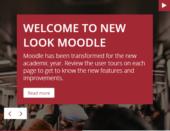
Following extensive testing, we signed off on our new theme last week. So when you log into Moodle from 6am on 25th July what can you expect to see? This blog post highlights the top 5 improvements in Moodle 3.4.
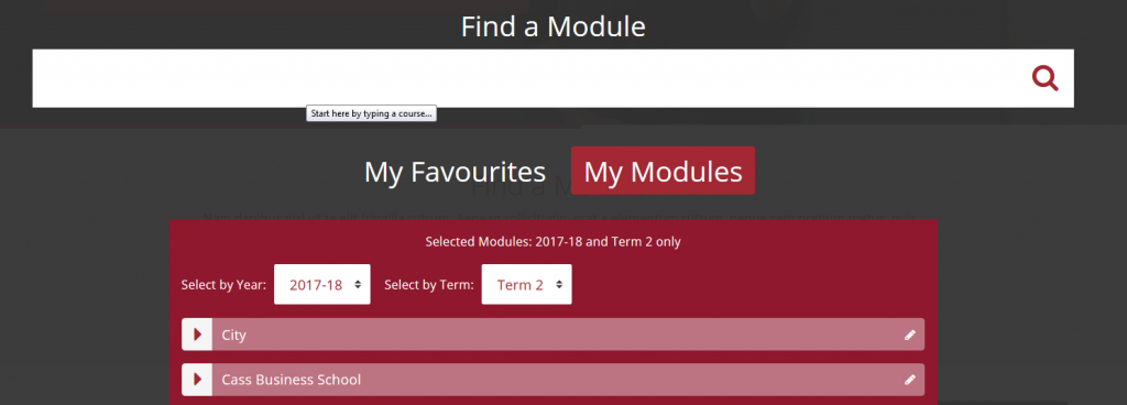
1. Streamlined module search
We’ve transformed the My Moodle page. Different mechanisms to help you find a module are streamlined with our new Find a Module functionality.

2. Dashboard and Collapsed Topics
The Module Dashboard has been redesigned to improve contrast and accessibility and to make it easier to use. You can now change the order of activities to prioritise activities for your students.

We’ve kept Collapsed Topics to provide an overview of module content to students. Topics have improved contrast and easy to use editing features.

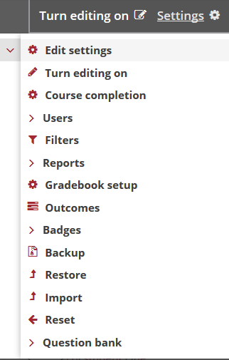
3. New settings menu
The Settings menu is persistent (you won’t have to click to keep the second layer menu open) to enable easy navigation back and forwards through the menu.

4. Favourite within a Module
Do you need to visit a module regularly? You can Favourite any module while reviewing it.

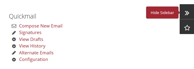
5. Hide Sidebar
You can choose to hide blocks in the right column to prioritise content while working on your module using the Hide and Show Sidebar feature.

Top 5 Improvements Poster
Help us to promote the new look for Moodle by printing an A3 Poster for your office. Alternatively, contact us via ServiceNow to print one for you.
Preparing for the New Look Moodle
As we posted in May, we are keeping functionality changes to a minimum so that you are not overwhelmed with new options and menus. We’ve concentrated our efforts on streamlining and improving functionality. As with any change, staff and students did say that there was a learning curve with the redesign in terms of new Settings menu and Find a Module functionality, but they reported that they found it easy to settle in and find their way around Moodle and complete the tasks required.
To help you settle in to using Moodle, our Moodle in a Minute screencasts will be coming soon. They will provide a more visual overview of the changes so you can see how it all fits together. The screencasts will provide more detailed information on the new core features and improvements. We are developing workshops and webinars on Moodle 3.4 and we will be in touch with further information about dates and locations.
Our next post in this series will be the first of our Moodle in a Minute screencasts which will provide an overview of the main changes in Moodle 3.4.

